Starter Kit For Painting On Canvas
With so many paint colours available and new ranges being released every week, which colours should you buy when you first start painting?
The overwhelming feeling that descends when trying to buy paint colours either online or in your local art store can often lead to the safe bet…
The pre-boxed starter set.
The paint companies have designed them to help you, right? The best paints for your needs when you are just beginning…or so you would think.
But are they a good choice?
Are you getting the best value for money or are they sending you down the wrong path? I've devised a simple technique to help you decide which starter palette is right for you.
Ready for a little paint history lesson to understand what you should be thinking about on your next trip to the art store?…
Boxed starter sets are designed to give you a varied approach, a range of colours that can give you the widest colour gambit with the minimum amount of outlay.
But here's the rub.
It depends on what you're aiming for with your end result. If you think about the paintings that you want to achieve, the subject matter you are most drawn to before you actually buy your paints then you can make an educated guess which colour palette is going to be right for you.
The Old Masters
In Renaissance times, the Old Masters learnt their trade of painting as a craft.
The tradition of the craft had a system of apprenticeship.
Colour mixes were kept secret and passed on from generation to generation, some painters even created their own codes to keep the secret mixes safe.
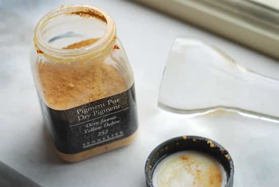
Working under apprenticeships in individual Ateliers (the French word for "workshop") was the norm. Artists learnt how to grind their own paints from the natural earth pigments surrounding them. Working from dry pigments, they had to be mixed with oil and then ground into a paste by hand to make paint.
The colour choice was limited and paintings relied on the use of dramatic lighting and tonal value to produce great works. (see: The Importance of contrast in painting)
Working with this limited available palette can teach you a great deal about colour mixing and warm and cool colours. I've made a free still life video course that shows you a classical approach to painting using just burnt sienna, ultramarine blue & titanium white.
Masters Palette – Perfect for portraits & understanding the importance of tone.
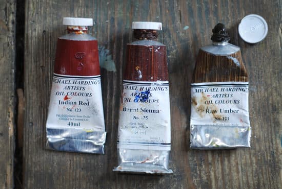
When the Old Masters were mixing colours, the pigments came from the earth, literally ground up rocks and minerals – hence the muted palette being called the earth colours.
When painting portraits, they couldn't just go out to buy 'flesh tint' they looked, observed and mixed it.
Burnt umber, raw umber, yellow ochre, burnt sienna, red ochre, these are the sorts of colours they would have been using.
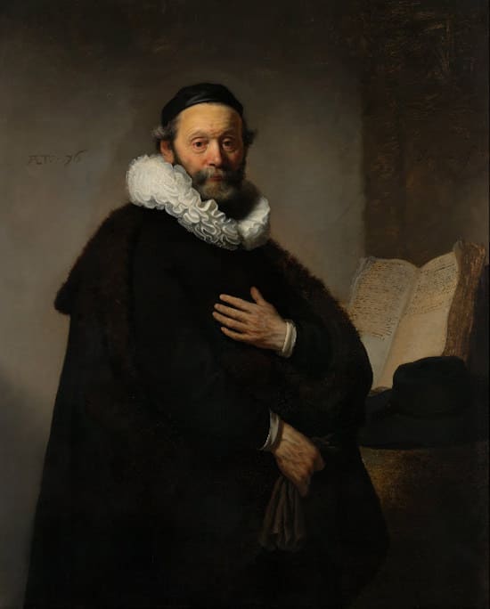
Rembrandt,Portrait of Johannes Wtenbogaert, 1557-1644, Oil on canvas
If you want to try and recreate an Old Master-style painting, using the pigments they used, gives you an immediate head start. In my article on 'How to choose a basic portrait palette' I use a muted collection of colours.
Skin tones are muted, so start with a muted colour. It seems obvious right? But when you're painting the urge to try and 'fix it' by adding an extra colour is huge.
Don't feel like it's only you, I still do it now after 20 years, even though I should know better!
Pro tip: You can achieve the same hues with modern pigments (see videosHow to match flesh tones) but it makes it a bit harder. It's a harder visual jump for your eyes to make a muted skin tone using bright cadmium yellow rather than using a muted yellow ochre.
How to choose a Rembrandt Palette
Masters – If you want a muted classical feel to your paintings this is the best step forward.
A modern version of Rembrandt's palette should include:
- Titanium white (a safer alternative to lead white)
- Naples yellow
- Yellow ochre
- Burnt sienna
- Burnt umber
- Raw umber
- Green umber (for landscapes)
- Venetian red/Vermillion
- Ivory black
Rembrandt was known for his complex mixtures rather than raw colour (our equivalent of 'straight' from the tube) and used a mix of solid painting and glazing to add a variety of hues.
Monet & the Impressionists
The Industrial revolution was key in the creation of the Impressionist's painting movement.
Oil paints became readily available so there was a shift from painting as a craft, to painting as art. But with this shift, there was an inevitable gap in technique and colour theory.
Let me introduce you to the artists' Colourman.
The 'colourman' mixed paint and sold it direct to the artist. Some of the colourmen were integral to the rise of Impressionism, with Julien Tanguy nicknamed Pere Tanguy (Father Tanguy) as a nod to his support of the artists. He often used to take an odd Cezanne or Van Gogh as payment for his paints.
Artists during this period had more freedom and often didn't have as intense 'hands-on' training in colour mixing. There was also a huge increase in paint colours that were readily available.
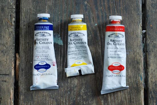
Paint mills that could mechanically grind the pigment allowed for the mass production of artists' colours. Matched with an ever-increasing range of man-made colours being developed, the colourman went from a small-scale specialized craft to larger companies looking for a market share.
Just like a director has a cinematographer, an artist needed a good colourman to produce the specific colours he was after. They became an indispensable part of the process.
Pro tip: There is a fantastic shop in London called L Cornelissen & Son,they have been colourmen since 1855 and it is an Aladdin's cave of pigments and potions.
Monet's Palette – Perfect for landscapes, pastels palettes and impressionist techniques.
"The point is to know how to use the colors, the choice of which is, when all's said and done, a matter of habit. Anyway, I use flake white, cadmium yellow, vermilion, deep madder, cobalt blue, emerald green, and that's all."
Claude Monet, 1905
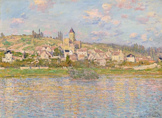
Claude Monet, Vetheuil, 1879, Oil on canvas
During the Industrial Revolution, there was a breakthrough in colours. Man-made chemically produced paints that had a stronger colour than previously available pigments. This resulted in a huge rise in the use of colours in shadows and an abandonment of black in the painter's box. Velázquez wouldn't have dreamed of painting without a black (in fact he used two) but the new era brought new techniques and new myths about black to the art room.
These produced more powerful and permanent colours (Reynolds would have approved as many of his portraits are greyer than when first painted because the pigment he used, faded!)
How to choose a Monet style Palette
Monet – If you want to capture an impressionistic feel to your paintings this creates a lively palette.
- Lead white (modern equivalent = titanium white)
- Chrome yellow (modern equivalent = cadmium yellow light)
- Cadmium yellow
- Viridian green
- Emerald green
- French ultramarine
- Cobalt blue
- Madder red (modern equivalent = alizarin crimson)
- Vermilion
Modern
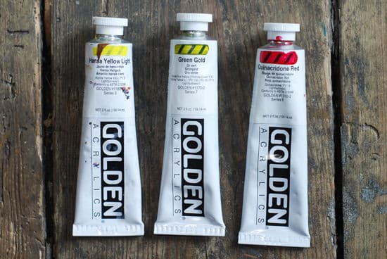
In the 20th Century with new methods of production, the invention of Acrylics and modern chemistry, cleaner more transparent colours could be produced.
These new pigments have an excellent film clarity and a wide colour range. Often they can have a powerful tinting strength which can easily lead to an unbalanced and inharmonious colour arrangement if not treated with care.
The pigments names are often hard to pronounce, like Quinacridone red and Anthraquinone Blue but they provide mixtures of remarkably clean, intense colour blends that retain their brilliance even in the thinnest wash or glaze.
It was during this period that the art scene exploded with Pop art and American expressionism that utilized bright, clean solid blocks of colour.
These new modern colours enabled the artists to express their reaction to the rise in mass consumerist culture and echoed the colours being used in advertising and the mass media.
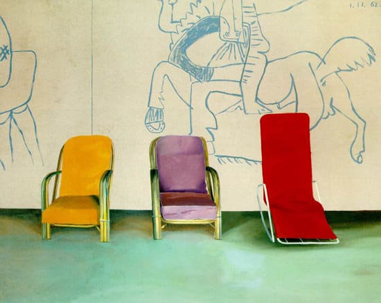
David Hockney, Three Chairs with a Section of a Picasso Mural,1970, Acrylic on canvas
Where Monet and his contemporaries were embracing the natural world and painting Plein air, (a French expression which means "in the open air") Warhol called his studio 'The Factory' reflecting these times.
A Modern Palette – Perfect for vivid mixes, contemporary pieces and experimental techniques.
These can vary depending on how opaque or transparent you want your colours to be. The ones below are all transparent which makes them perfect for glazing and colours like phthalo blue (green shade) are a high tinter, so when mixed with titanium white produce a really vivid blue with a kick!
Check out this video to see the difference between phthalo blue and ultramarine blue.
How to choose a Modern style Palette
Modern – Like bright vivid colours? You're going to need a modern palette.
- Hansa Yellow Light
- Hansa Yellow Medium
- Naphthol Red Light
- Quinacridone Magenta
- Anthraquinone Blue
- Phthalo Blue (Green Shade)
- Phthalo Green (Blue Shade)
- Titanium White
So choosing an effective paint palette is a personal choice.
- Titanium white
- Cadmium yellow light
- Permanent alizarin crimson
- Ultramarine blue
- Burnt umber
They are mostly from the Master's palette and have a good level of opacity and colour range without being too overwhelming!
However, if you want your paintings to go in a particular direction then use the guide above to create your own perfect box set.
Starter Kit For Painting On Canvas
Source: https://willkempartschool.com/how-to-choose-the-best-acrylic-starter-set-without-making-a-colour-mixing-mistake/
Posted by: lilleyhormser.blogspot.com

0 Response to "Starter Kit For Painting On Canvas"
Post a Comment